For over 25 years The International Forum has been hosting 3 events annually. Each one is attended by over 3,000 delegates who connect to discuss ideas on how to improve healthcare safety.
Once COVID struck, the Forum needed to adapt rapidly. Having worked with the team since 2016 I was asked to devise a way of quickly enhancing the branding and visuals so they were better adapted to deliver their events virtually.
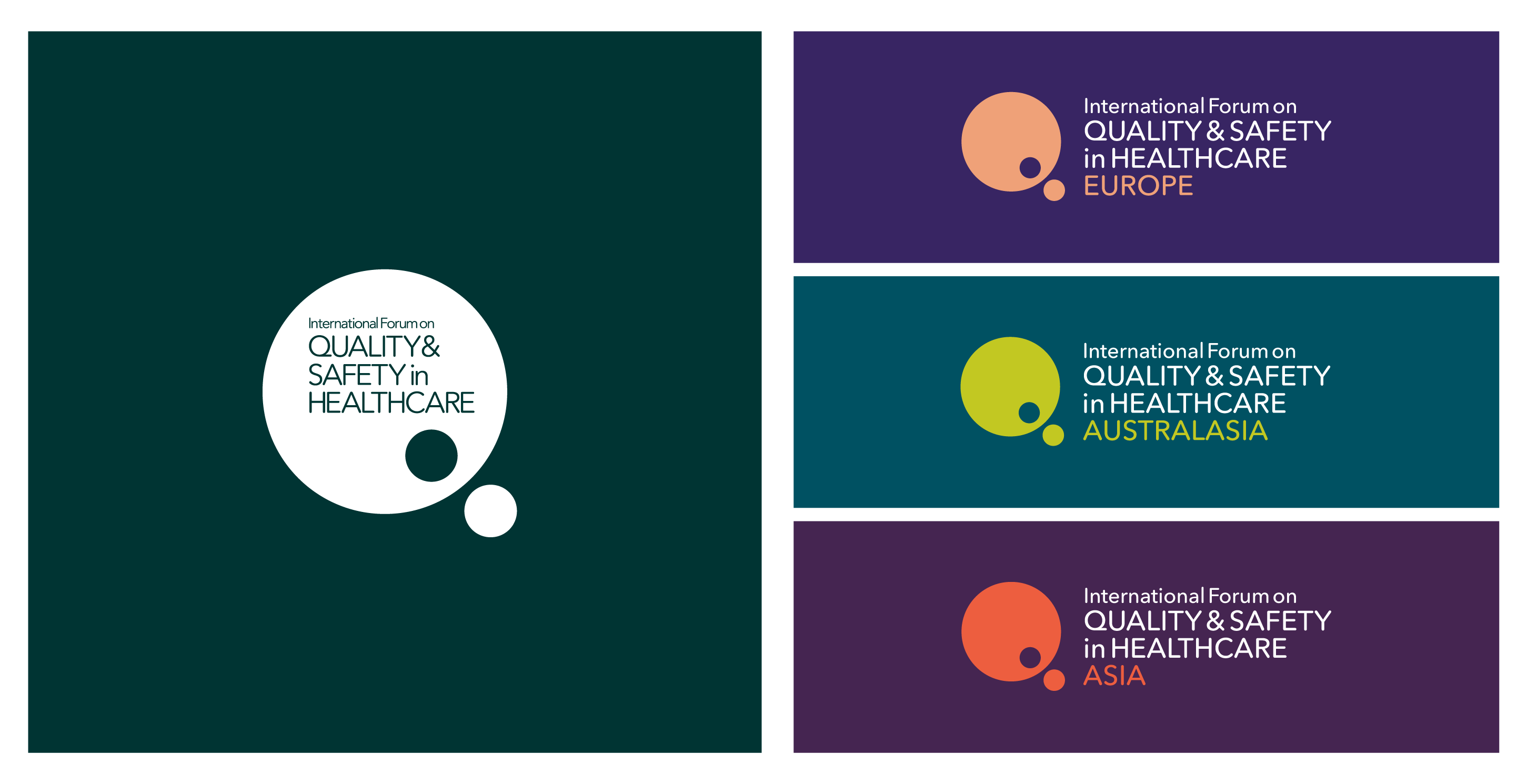
The old logo (below left) which had been used long before I started working with the International Forum had served it’s purpose well. However now was a good opportunity to make some improvements.
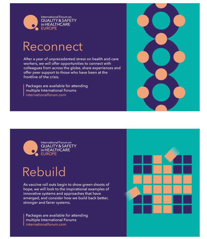
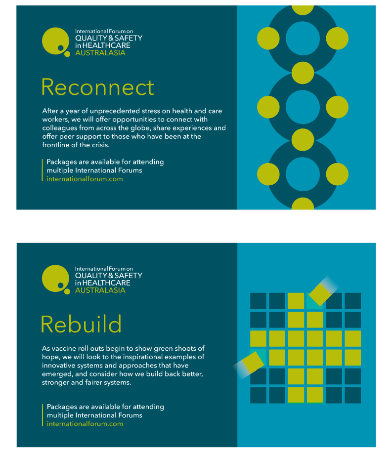
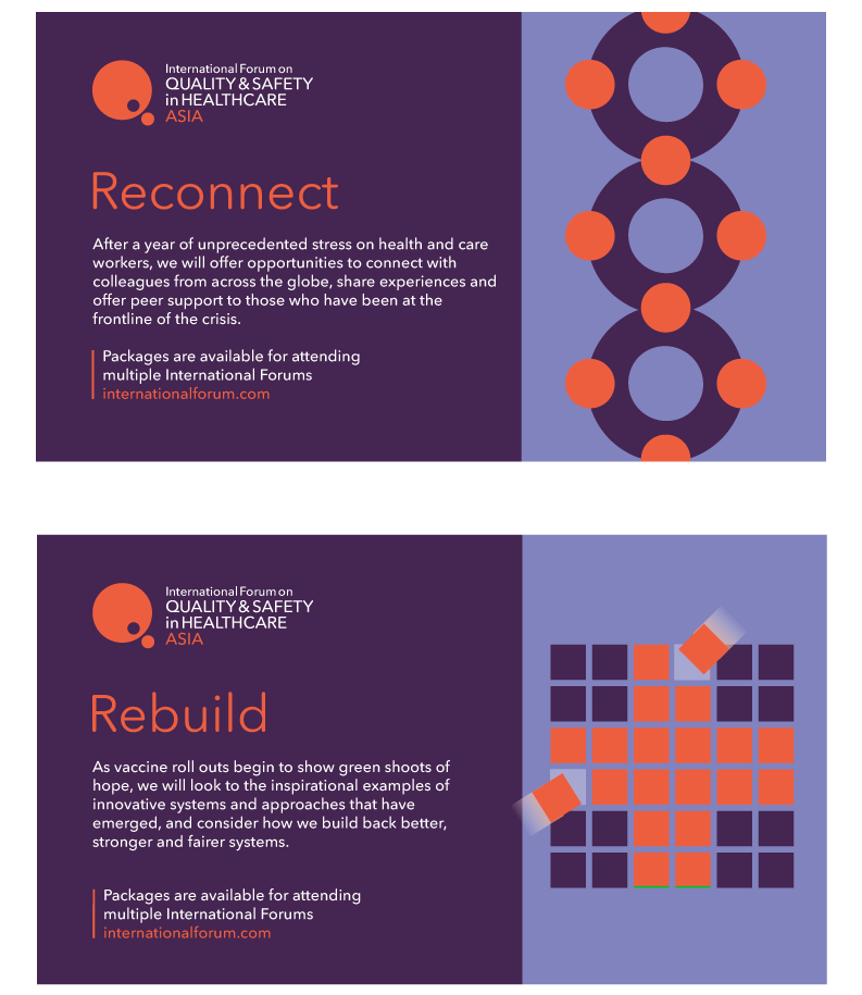
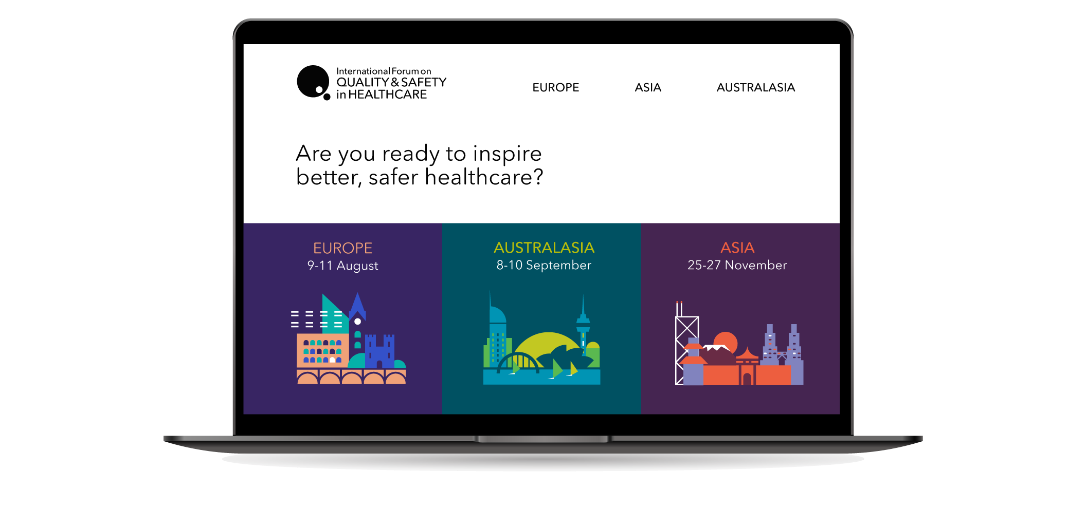
The refreshed design (below right) is bolder and simpler in order to improve visibility and flexibility. The 3 region names are now part of the identity and each one has had its own new distinct colour palette to make recognition easier.
Once COVID struck, the Forum needed to adapt rapidly. Having worked with the the team since 2016 I was asked to devise a way of quickly enhancing the branding and visuals so they were better adapted to deliver the events virtually.
The old logo (below) which had been used long before I started working with the International forum had served it’s purpose well. However now was a good opportunity to make some improvements.
The refreshed design (below) is bolder and simpler in order to improve visibility and flexibility. The 3 region names are now part of the identity and each one has had its own new distinct colour palette to make recognition easier.
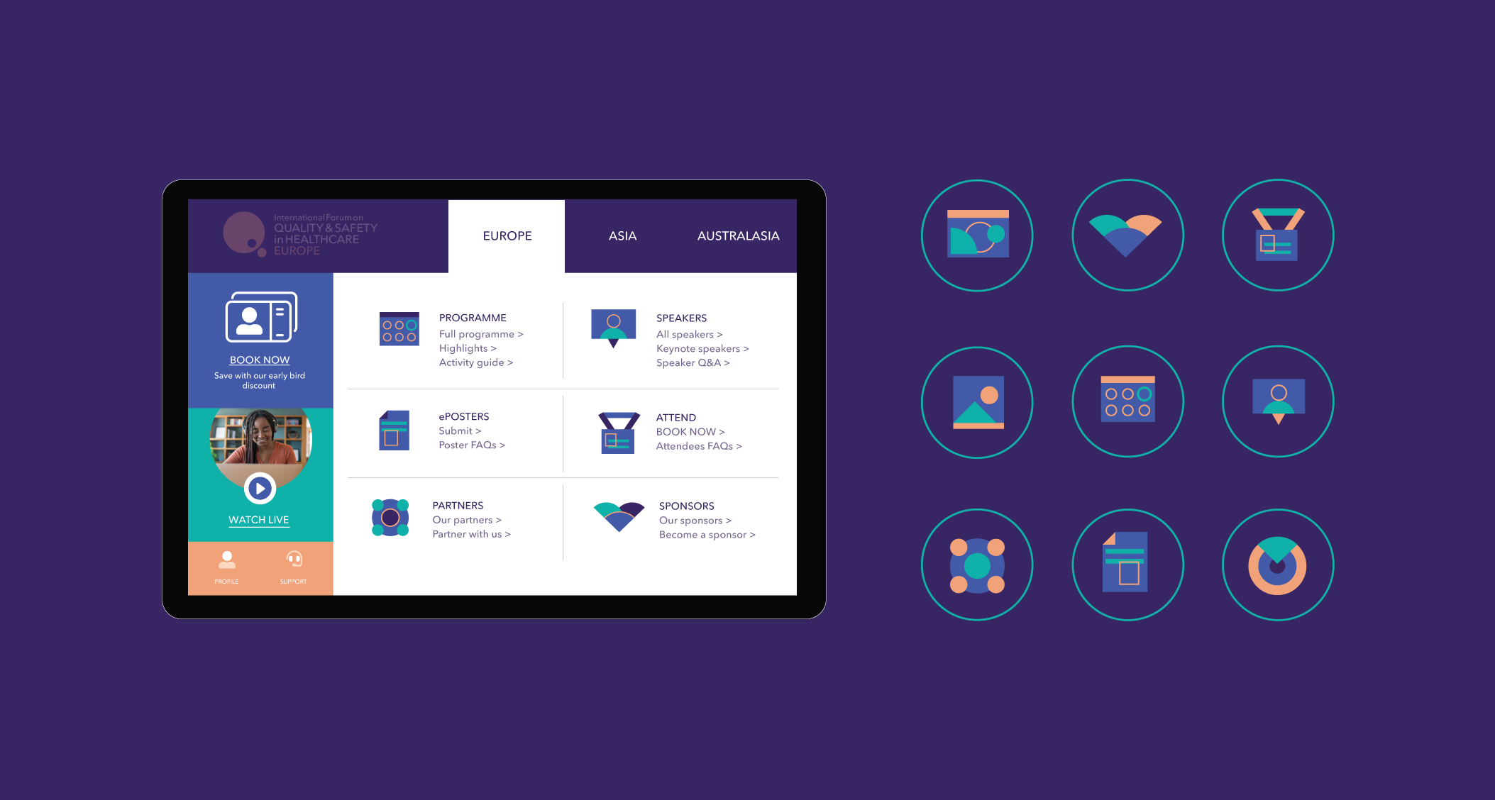
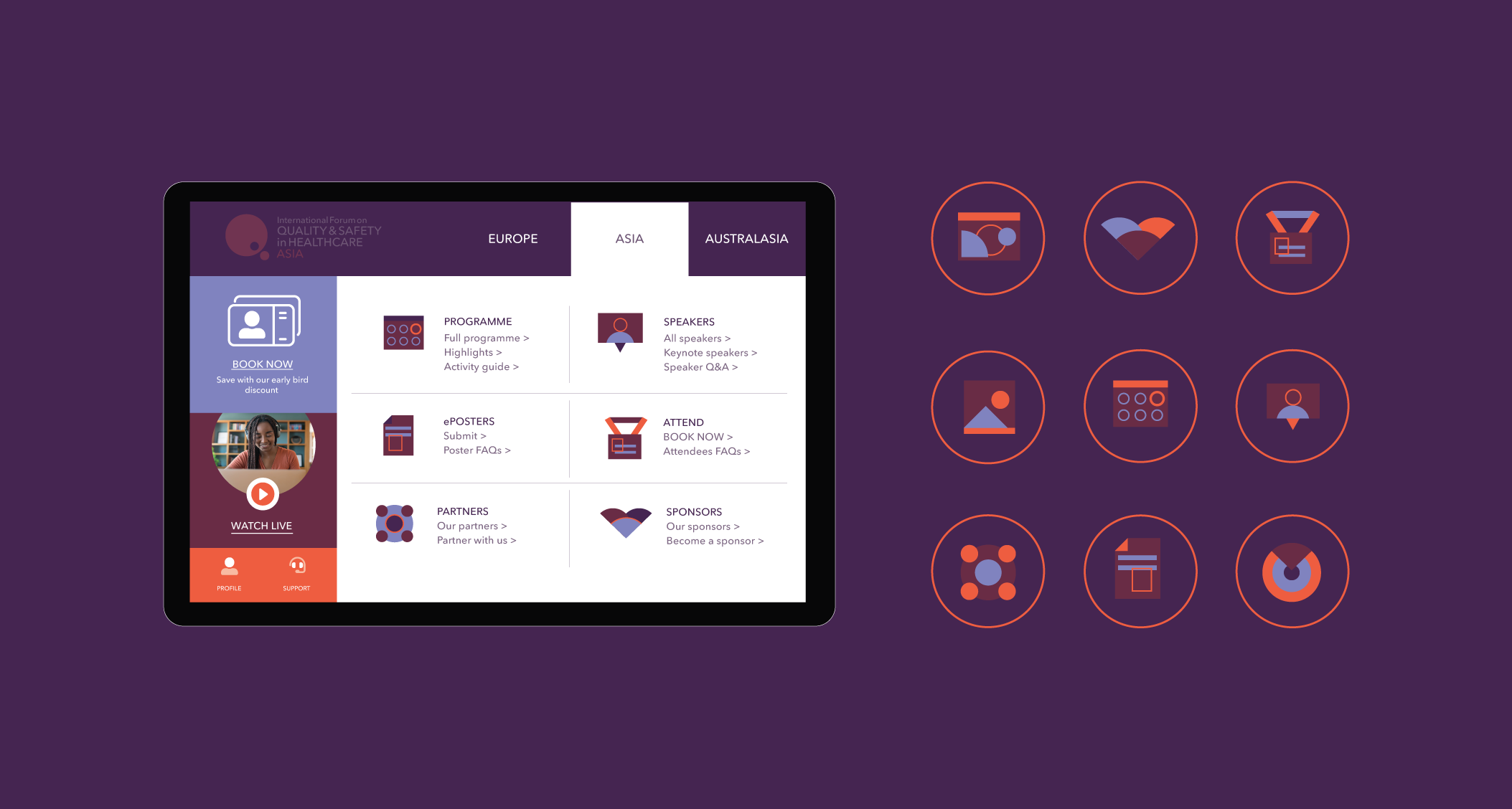
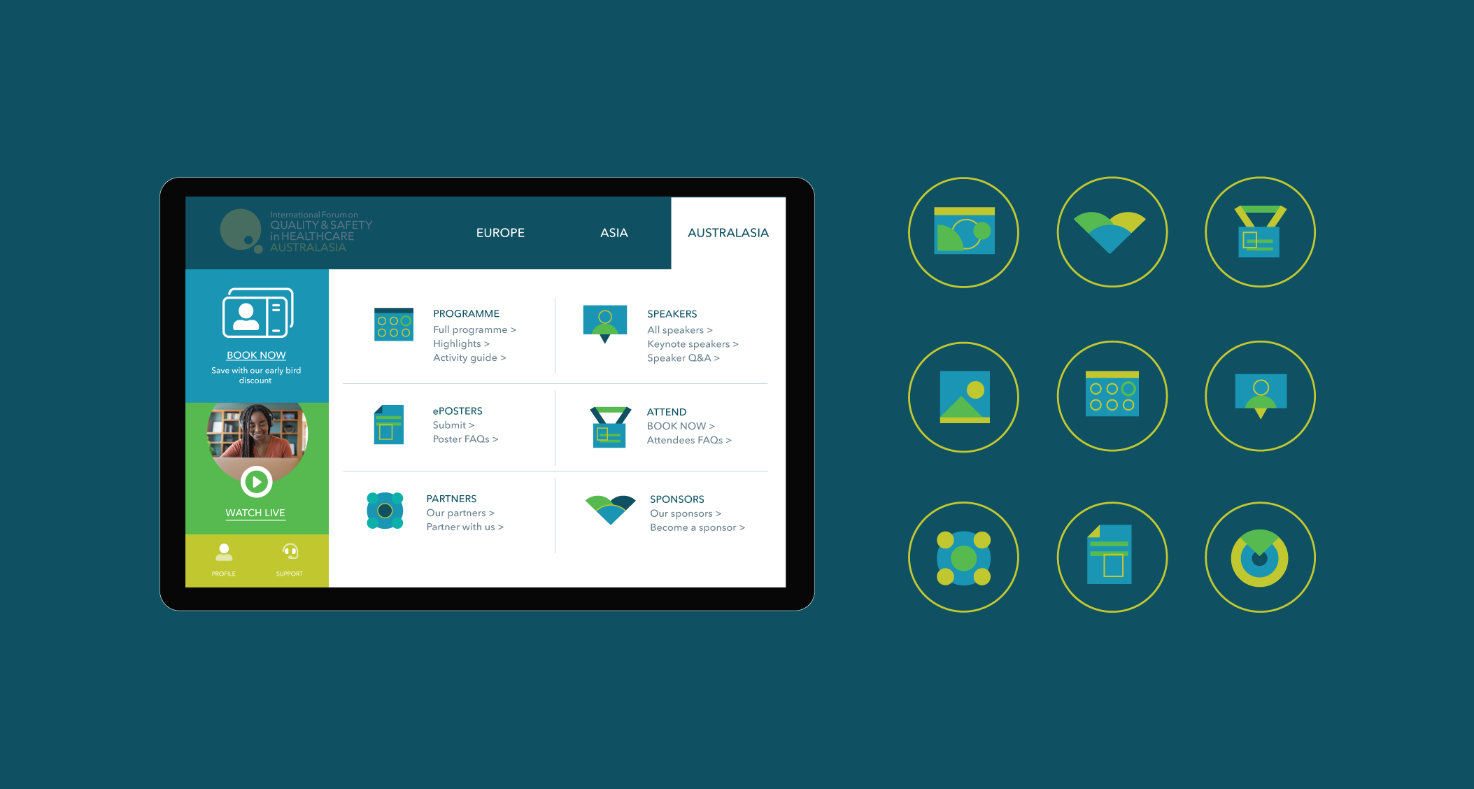
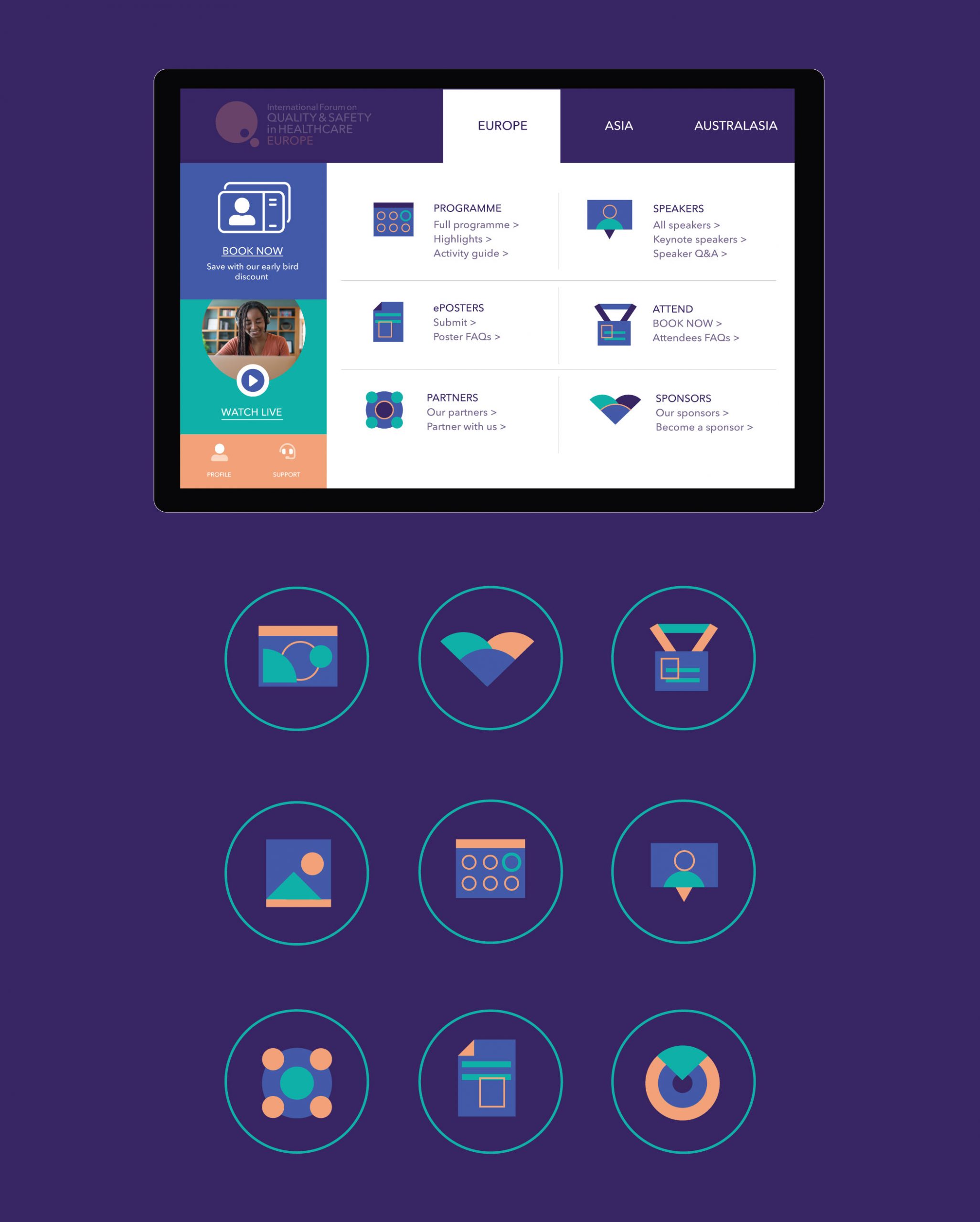
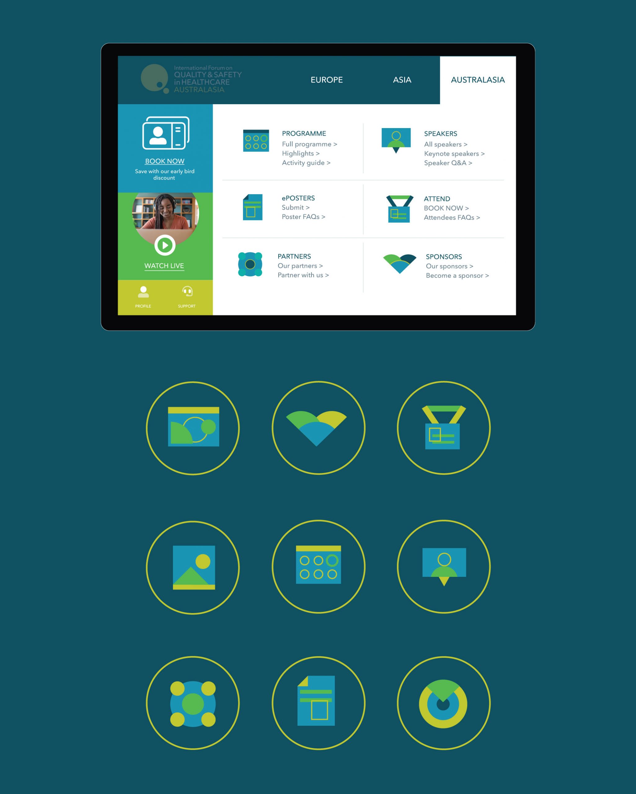
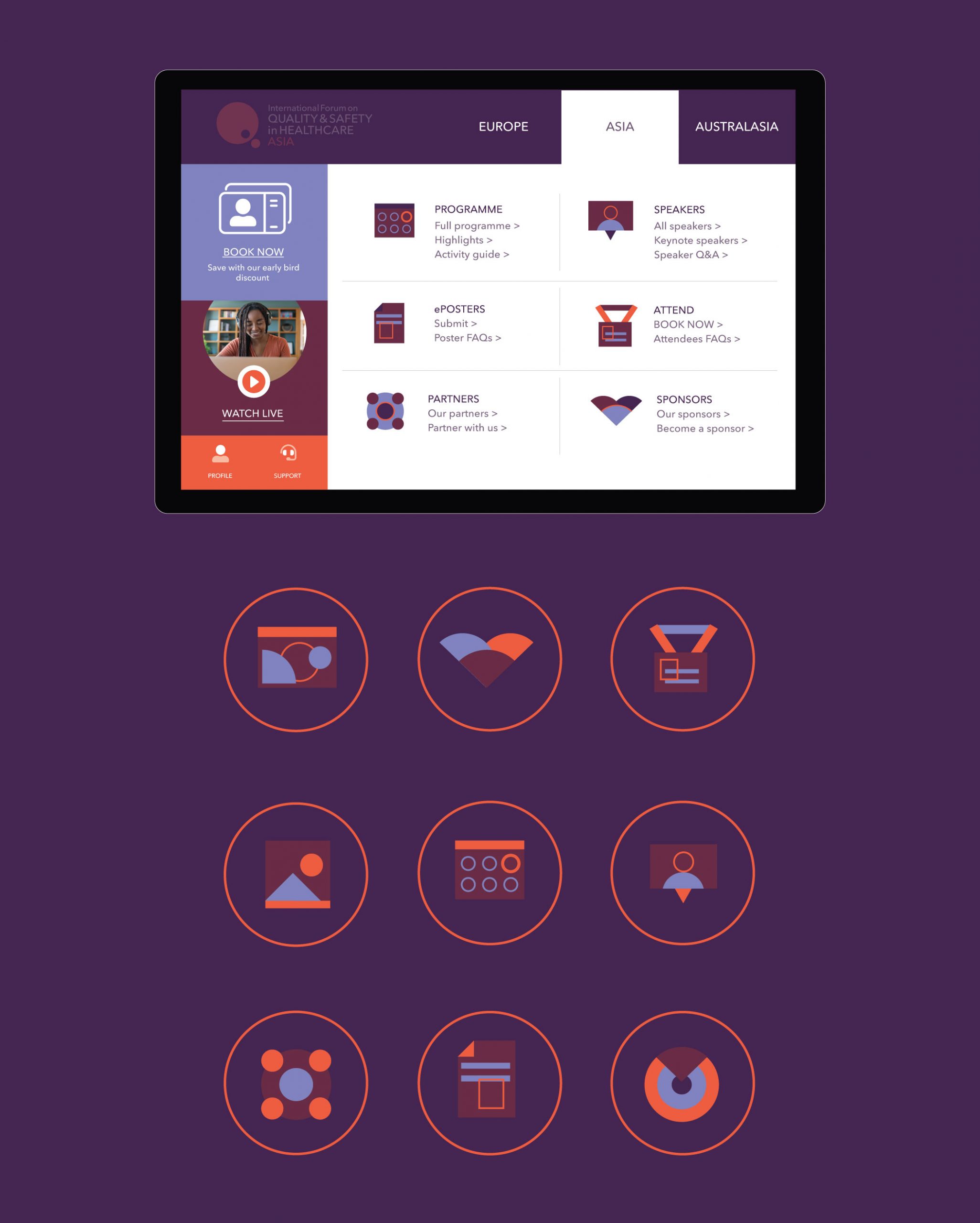
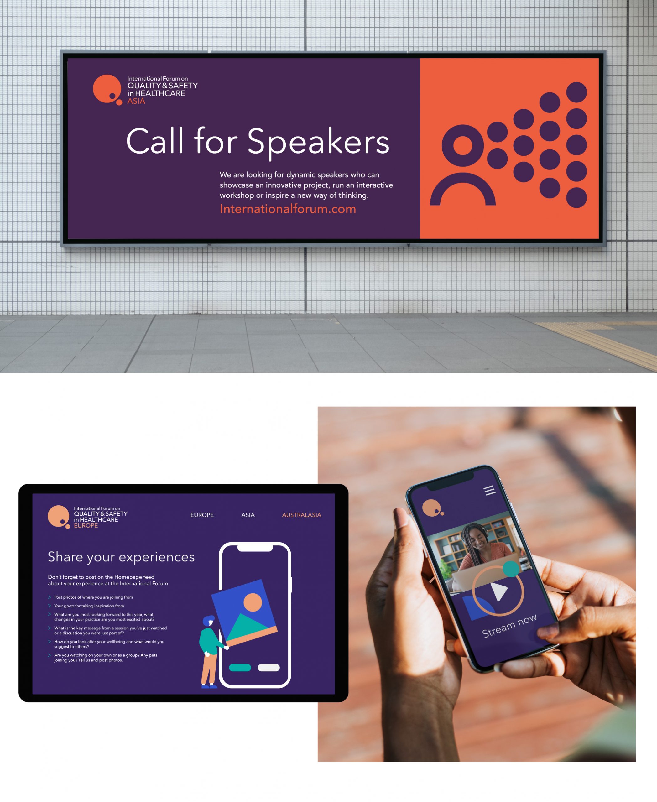
Following on from the refreshed identity and colour scheme. I created a whole suite of graphics and icons which were more flexible for on-screen use and could replace the event photography which was used previously to market the events.